The logo explained
Introduction
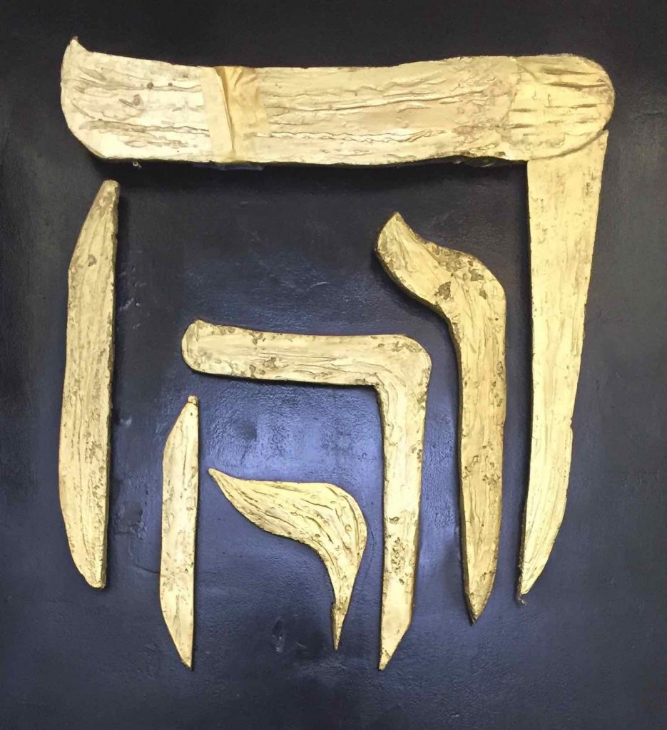
The logo of Tikkun Olam is a design from Tony Ulyesses Hayes. He positions the four letters of a name of God in such a way that they become a gateway. The name of God is a strong tower as can read in Proverbs 18:10. The righteous runs to it and cannot be conquered. It literally says: to be (inaccessibly) high.
This is one way to understand the meaning of this logo. We can enter through the four letters of His name so we can approach the Almighty. It is as if you are using the name of God to go deeper into Him. David talks about this in Psalm 62:7 in God Himself is his refuge.
On God my salvation and my glory rest;
The rock of my strength, my refuge is in God.
Psalm 62:7
We believe that the restoration of this world is only possible when we have learned to operated from within His name. When Jesus tells us that God will give us everything when we ask this IN His name, we experience that He could mean this literally. God invites us to take refuge IN His name and learn how to function from there. This logo expresses the desire we have.